Demystifing Tailwind Borders, Outlines, and Rings
Problem
Tailwind is one of the most popular CSS frameworks to use in web development because of its simple, utility-based approach in applying CSS styles. For me, it provides a lot of shorthand CSS helper classes that are used universally in a lot of webapps that I build.
In this post, I will cover the differences between the Tailwind border, outline, and ring utility classes.
This post's origin came about as I was creating a new UI component library for a webapp. I was creating a text input component whose boundary (using this word to represent border, outline, or ring) needed to change colors when the user selected the text input.
It seems simple, right? But, when you discover there are three Tailwind utility classes that can all do the same thing, you start to wonder which utility class to actually use.
I wanted to dig deeper and explore which of these utility classes you would want to use to show focus on a text input component.
Border
The border utility class is probably the class you are most familiar with when you want to create a boundary around an element.
One important thing to keep in mind is that borders are included as part of the width and height because Tailwind sets box-sizing: border-box by default.
Here's a comparison between two elements with the same width but different sized borders.
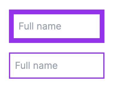
You'll see that the border is rendered on the inside of the element box.
The code:
  <input
    type="text"
    className="w-40 border-8 border-purple-600 p-2"
    placeholder="Full name"
  />

  <input
    type="text"
    className="w-40 border-2 border-purple-600 p-2"
    placeholder="Full name"
  />
No matter how large the border width is, the actual width of the elements remains the same size in the above example.
Outline
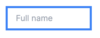
The outline utility class will create a boundary on the outside of the element box rather than on the inside like the border utility class.
The outline has two properties that make it different from the border utility:
- It's not constrained as part of the element's width or height like border, which makes it an excellent option to highlight an element without shifting other elements around it.
- There's an additional outline-offset-{x} utility class that lets you set the distance from the edge of the element box where the outline should be rendered.
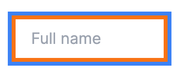
Here is an element with an orange border and a blue outline where the border and outline are the same width.
The code:
  <input
    type="text"
    className="px-4 py-2 focus:outline outline-4 outline-blue-500 border-4 border-orange-500"
    placeholder="Full name"
  />
If you are building out a text input component that has a border in the neutral state, you probably don't need to add an outline in the focus state. You can just change the color of the border in the focus state.
Ring
The ring utility class is the last way that you can create a boundary around an element. It's different from border and outline, whose Tailwind class is named the same as the CSS style. The ring utility classes uses the CSS box-shadow under the hood.
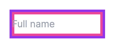
When you apply the ring and outline utility class together, the two boundaries will apply on the same plane, and the outline will overlap on top of the ring.
In this example, we apply an outline and ring of the same size, but you can only see the outline:
The code:
  <input
    type="text"
    className="px-4 py-2 outline outline-4 outline-blue-500 ring-4 ring-pink-500 w-40"
    placeholder="Full name"
  />
There are two properties that make the ring utility class more flexible than the outline:
- You can set an opacity to the ring color using a Tailwind opacity modifier: ring-blue-500/50
- You can set the ring to render on the inside of the element instead of the outside using ring-inset
For 2, the ring-inset will render within the border, so you need to mind your x-padding or the ring can overlap on top of the contents:
The code:
 <input
    type="text"
    className="px-0 py-2 border-4 border-purple-600 ring-4 ring-pink-500 ring-inset w-40"
    placeholder="Full name"
  />
Border, Outline, and Ring Together
To make it very clear how border, outline, and ring interact together, here's an example of all three utility classes applied on the same element:
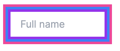
- The ring is pink
- The outline is blue
- The border is purple
The code:
  <input
    type="text"
    className="px-4 py-2 border-4 border-purple-600 ring-8 ring-pink-500 outline outline-blue-500 outline-4 w-40"
    placeholder="Full name"
  />
Finally, what's my recommendation for when you want to change a text input's boundary on focus? I would use a border class in the neutral and focus states, and I would turn off the default outline behavior on focus.
Here's the code:
  <input
    type="text"
    className="px-4 py-2 border-4 border-purple-600 focus:border-pink-400 w-40 focus:outline-0"
    placeholder="Full name"
  />
I hope this post helped to demonstrate the differences between the Tailwind border, outline, and ring utlity classes. Please subscribe below to get content similar to this post.